Honoring Heritage: The River Ridge Brewing Brand Refresh
If you’ve taken a look around our Projects page lately, you might notice a little bit of dust. There’s a good reason for that: we’ve been fully immersed in our work collaborating with our clients, capturing their stories and bringing their visions to life!
Recently, a project came along that is very close to our hearts.
In November of last year, my wife, Candy, stepped into the role of General Manager at
River Ridge Brewing here in Bellevue, Iowa.
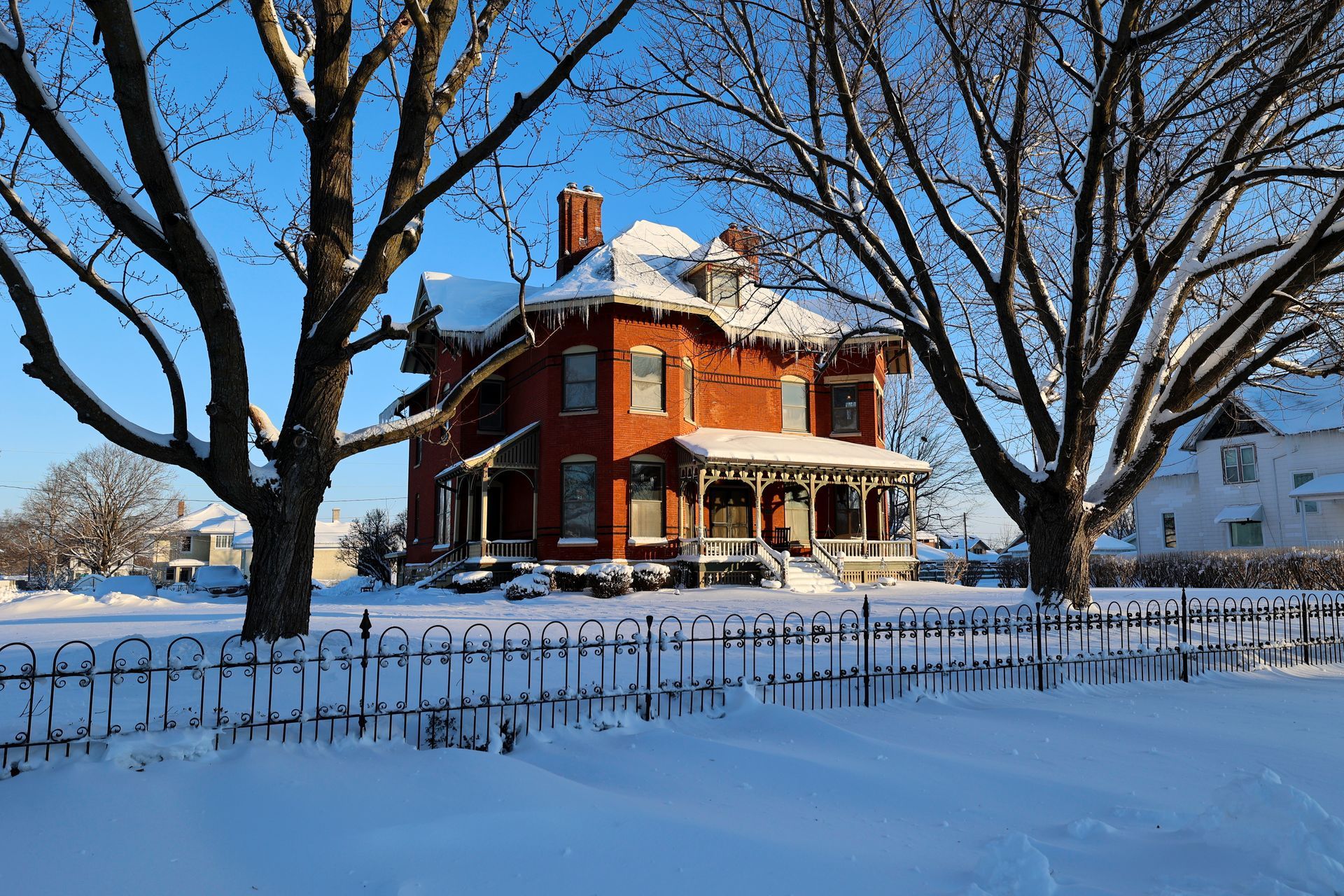
Housed in a historic building, right on the banks of the Mississippi, River Ridge has always been intended to serve as a true community hub—or as we love to call it, "Bellevue’s Backyard." With the brewery's milestone 10th Anniversary coming up this September, the vision for this year was clear: celebrate a decade of local history and continue building those strong community connections. As part of ushering in this new chapter, we decided it was the perfect time to restore the visual identity with a fresh look that recalls that original ideal.
The Soul of the Craft
Back in 2021, when the brewery moved into its current waterfront location, the branding shifted to a cleaner aesthetic to mark the new move. But as we looked at the story of River Ridge, we wanted to recall the brewery's roots. We wanted an identity that felt less minimalist and more "crafted"—evoking the rich character of our town, the location, and, of course, the amazing craft brews served there.
We teamed up to give River Ridge that
visual identity.
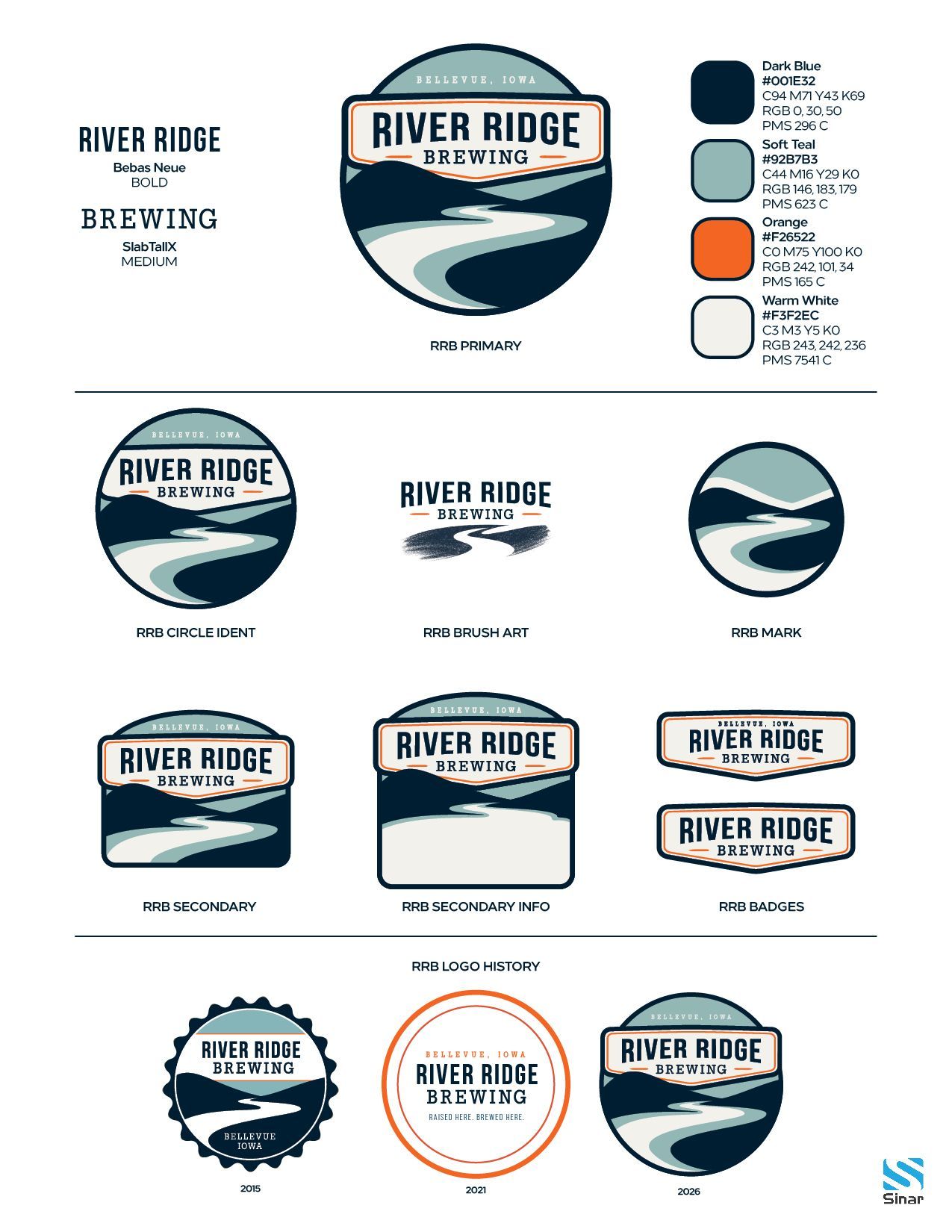
We kept the iconic circle framework that has tied all three generations of the logo together since the beginning, but we brought back the beloved river and ridge imagery. The stark white used in the previous two generations has become a warm, creamy "craft white" that immediately feels organic; like the creamy head on a freshly poured craft beer. Finally, we enveloped the text in a separate badge element that breaks through the frame. Not only does this badge look great on apparel and merch, but it completely unlocked our ability to solve the next branding puzzle: the new can designs.
One Grid, Endless Local Stories
Craft beer cans are a miniature canvas. We wanted a unified template system so that every can instantly looks like a "River Ridge" beer on the shelf, but still leaves room to tell a totally unique story in the center.
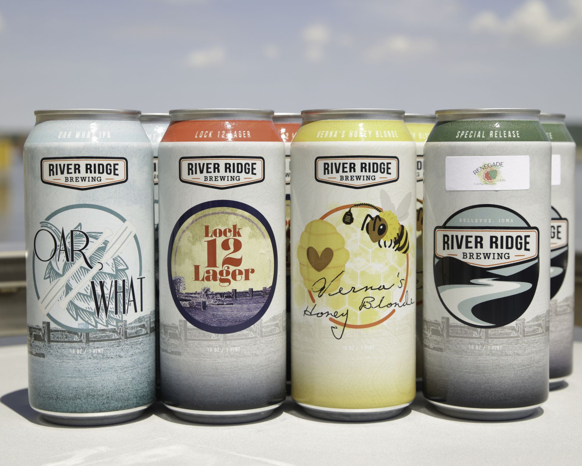
By placing the new badge element proudly at the top, we created a modular system where each core brew gets its own custom, circular illustration right in the center of the frame.
We are aiming to roll out all 8 core brews by the September anniversary. Here is a look at the first three we’ve brought to life:
1. Lock 12 Lager
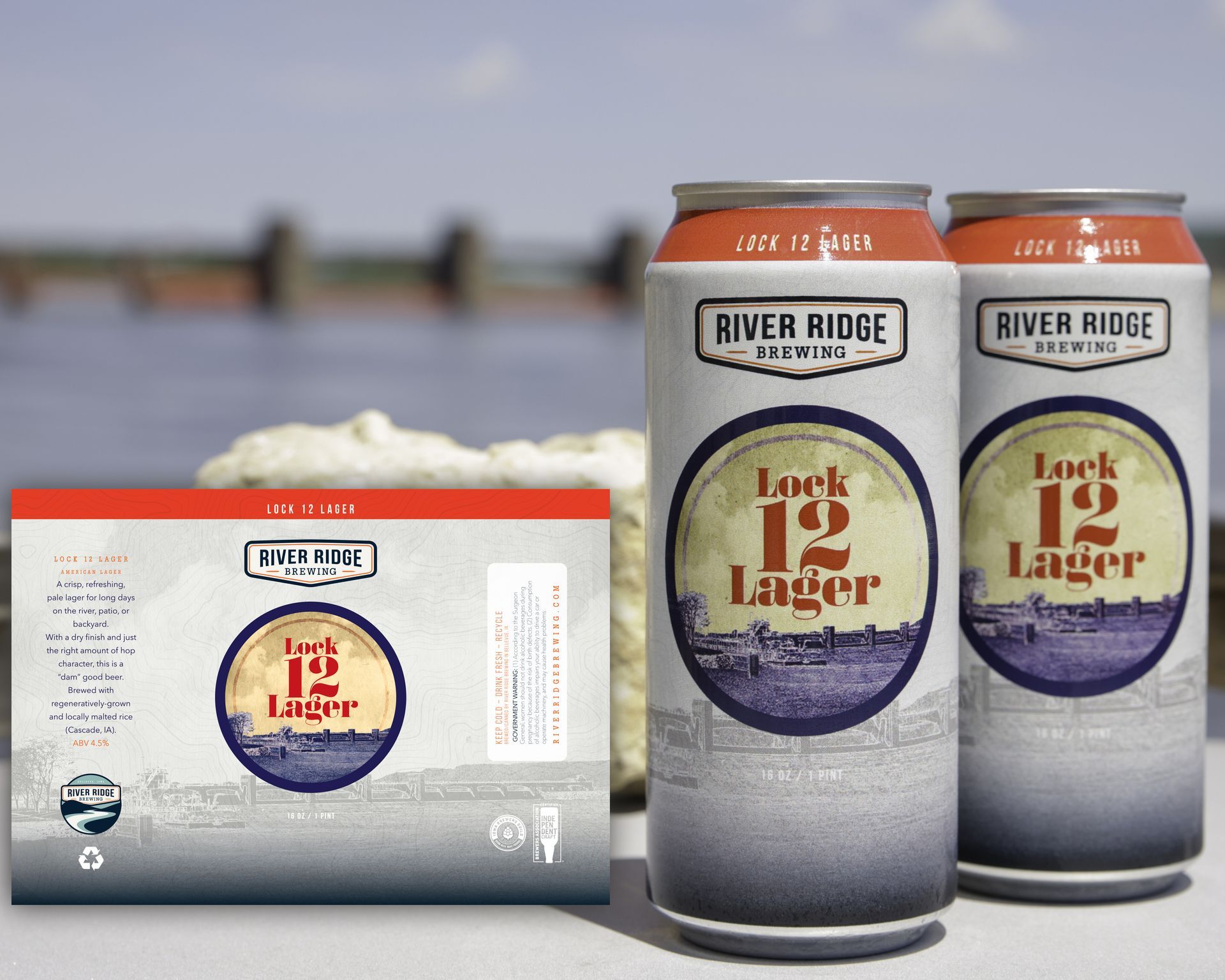
This one brings our creative journey full circle. Back in 2021, we designed a custom label for River Ridge to celebrate the
150th anniversary of the Bellevue Fire and Rescue department with the release of this new crisp, refreshing pale lager. Our hope was to follow this up with individually designed labels for the rest of the core brews. With a change of ownership, that intent had to be delayed. Now, under Candy's leadership, we were able to start again by including that original Lock 12 artwork, incorporating it into our new layout. The view of Lock and Dam 12 was captured from the patio of RRB using our trusty Canon 5D MkII, just at the point where a “tow” was locking through from south to north. Watching these huge barges float by the brewery is one of the highlights of an afternoon on the patio.
2. Oar What IPA
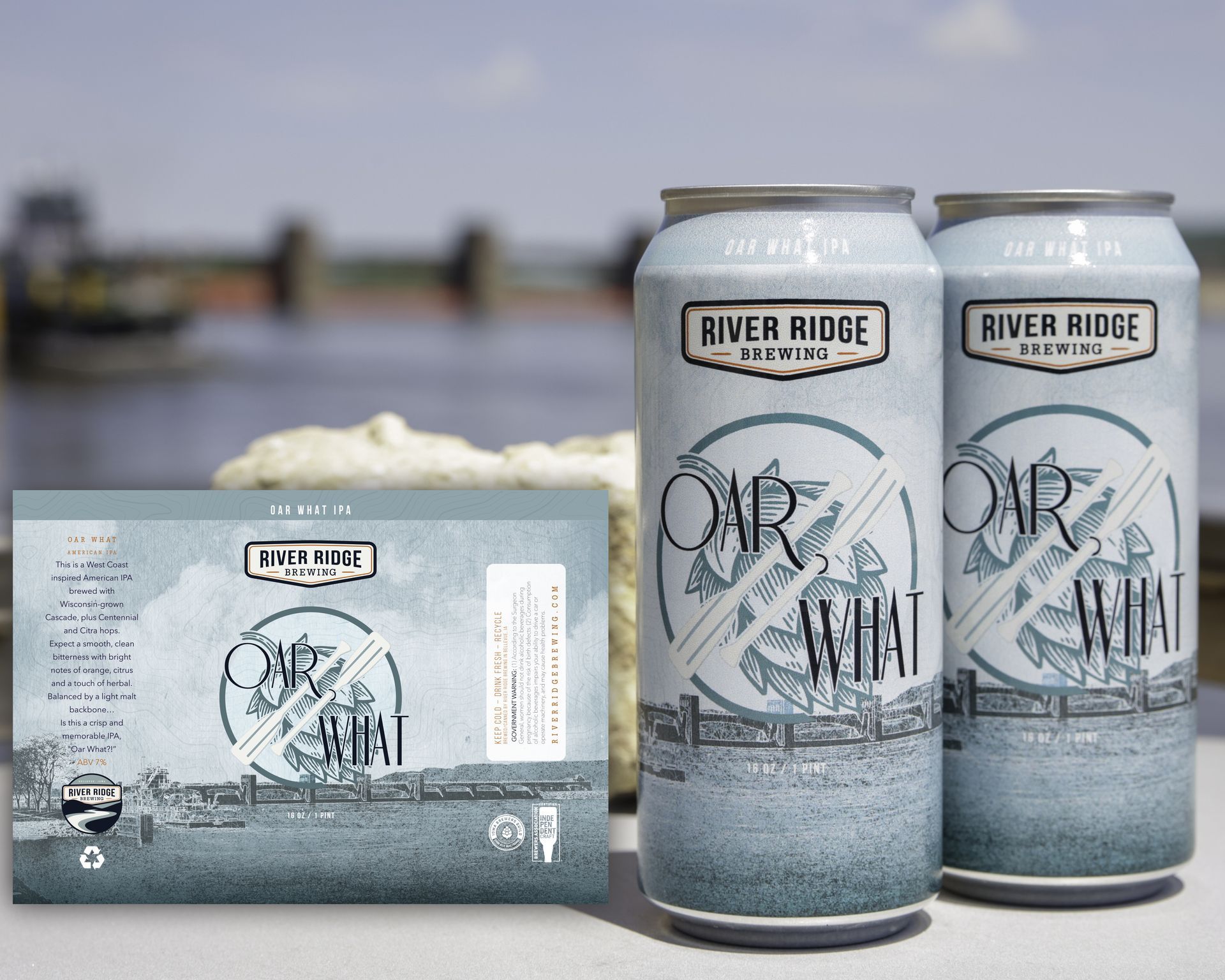
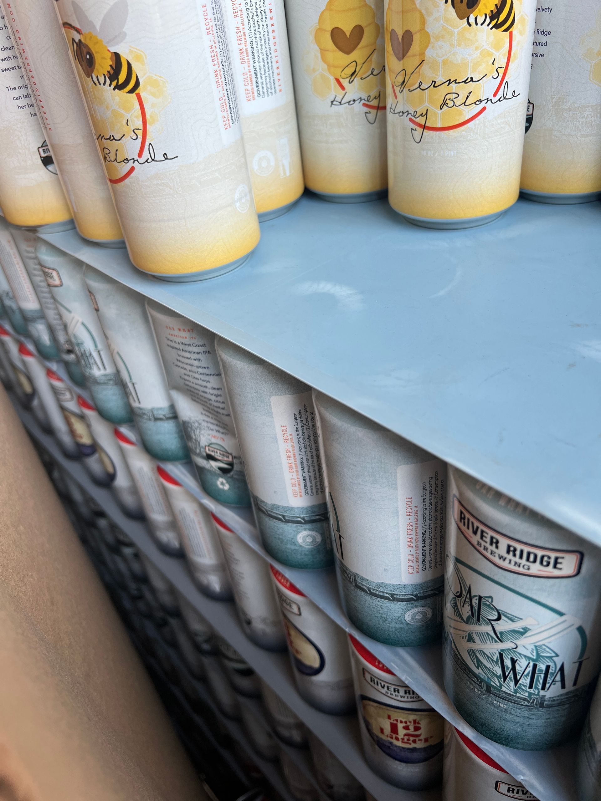
We wanted this can to invoke the bold, Art Deco style of the 1920’s, bringing to mind the history of boating on the Mississippi. The design was inspired by the era of the old Brandt factory, just a block away from the brewery, which used to produce performance motors for speedboats in the early 1900’s. Featuring a pair of classic wooden oars and distinct vintage typography, it grounds the beer right into the history of our neighborhood.
3. Verna’s Honey Blonde
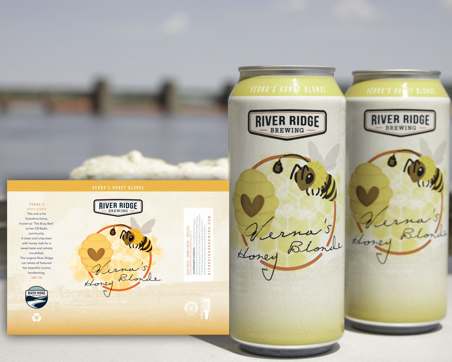
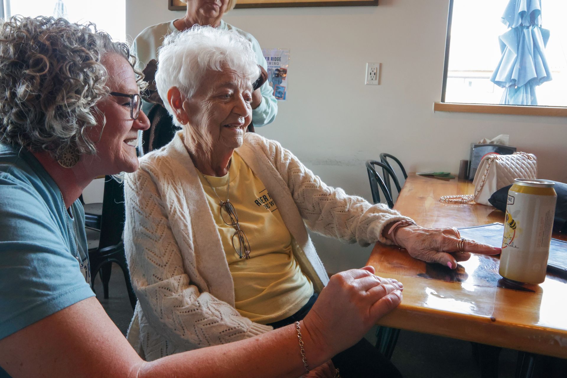
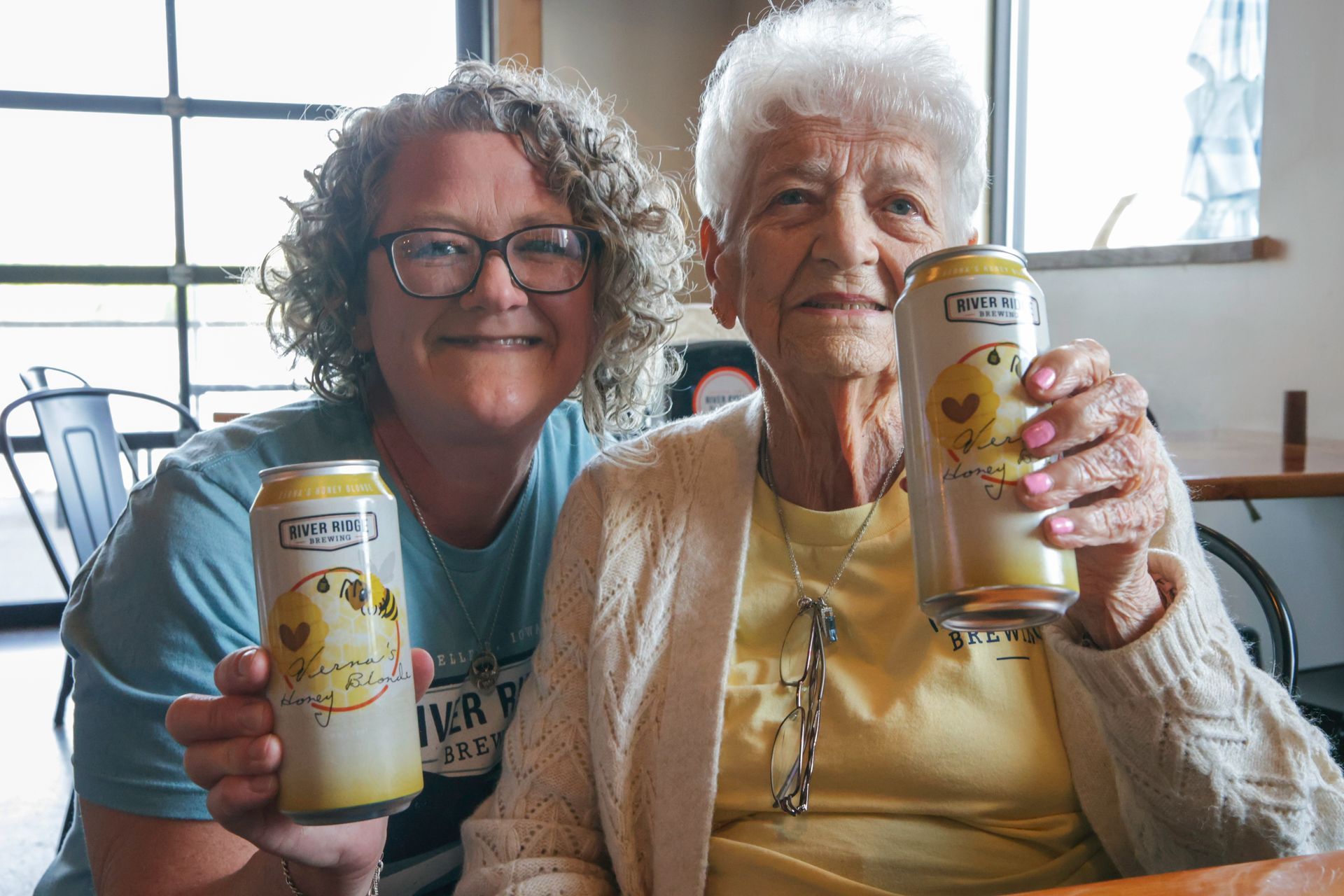
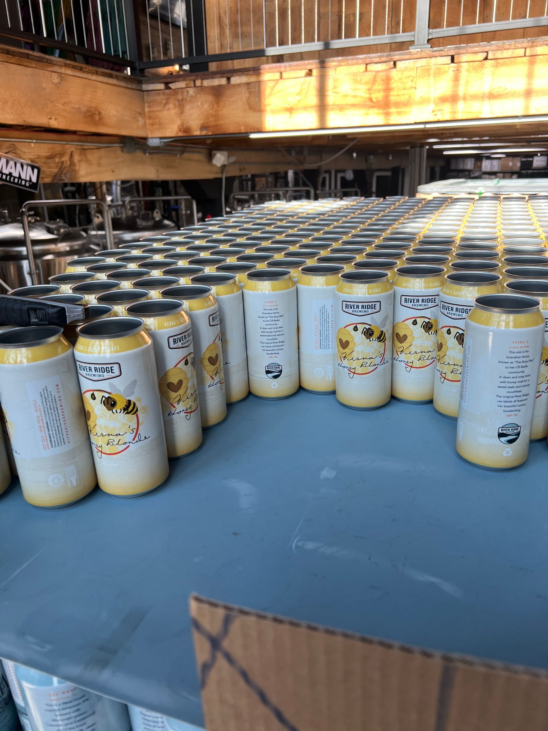
This one is the absolute heartbeat of the refresh. Back in the early days of the brewery, Verna - the grandmother of one of the original founders - used to handwrite the beer names on the labels in her beautiful script. For the front of the new can, we asked Verna to pick up the pen and write it for us once again. To make it even more special, the back of the can tells her story and mentions her CB radio handle:
"The Busy Bee." We recently had
the honor of presenting Verna with the very first sample cans. It was a beautiful night celebrating the history of River Ridge Brewing.
Lighting up the Waterfront
Watching a brand step off the layout grid and onto a physical building is where the real magic happens.
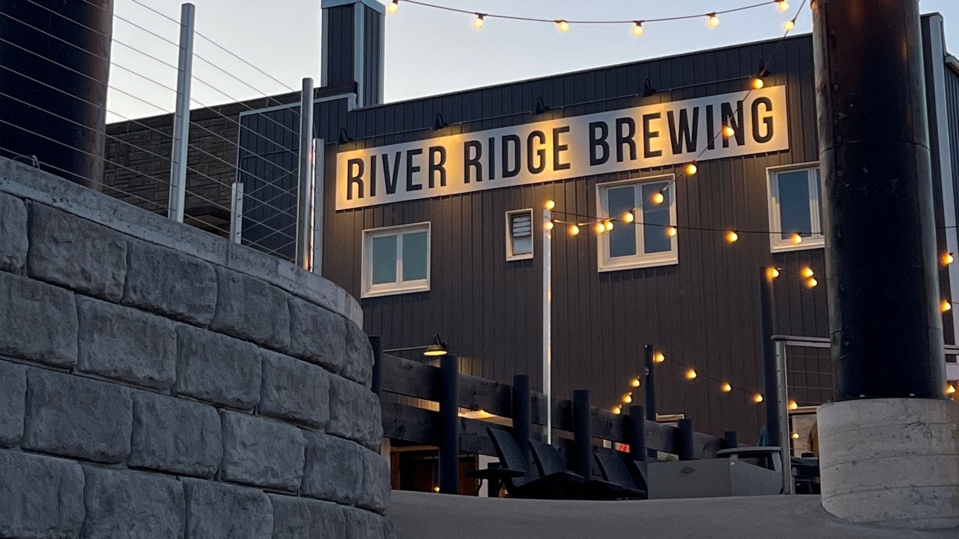
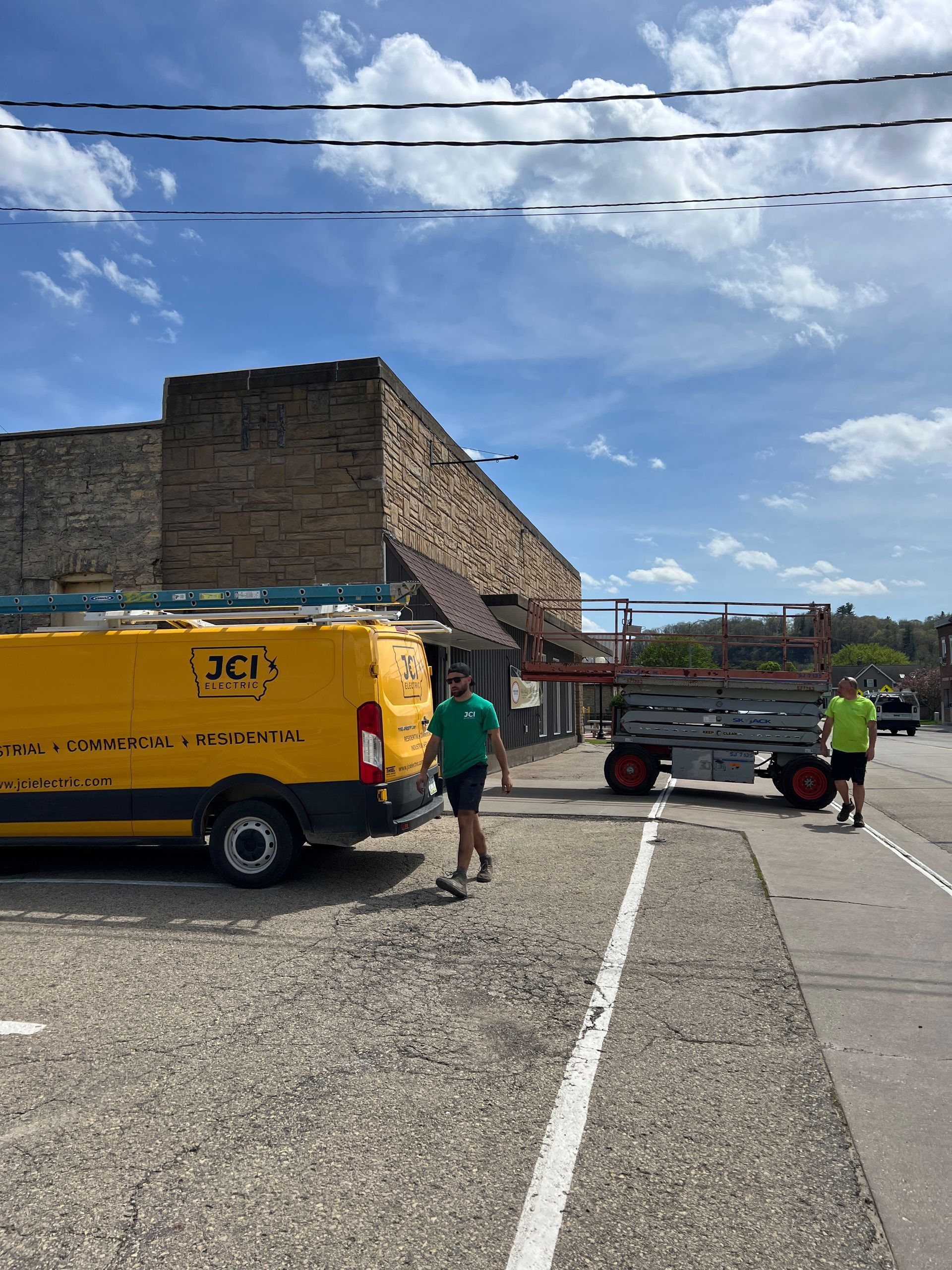
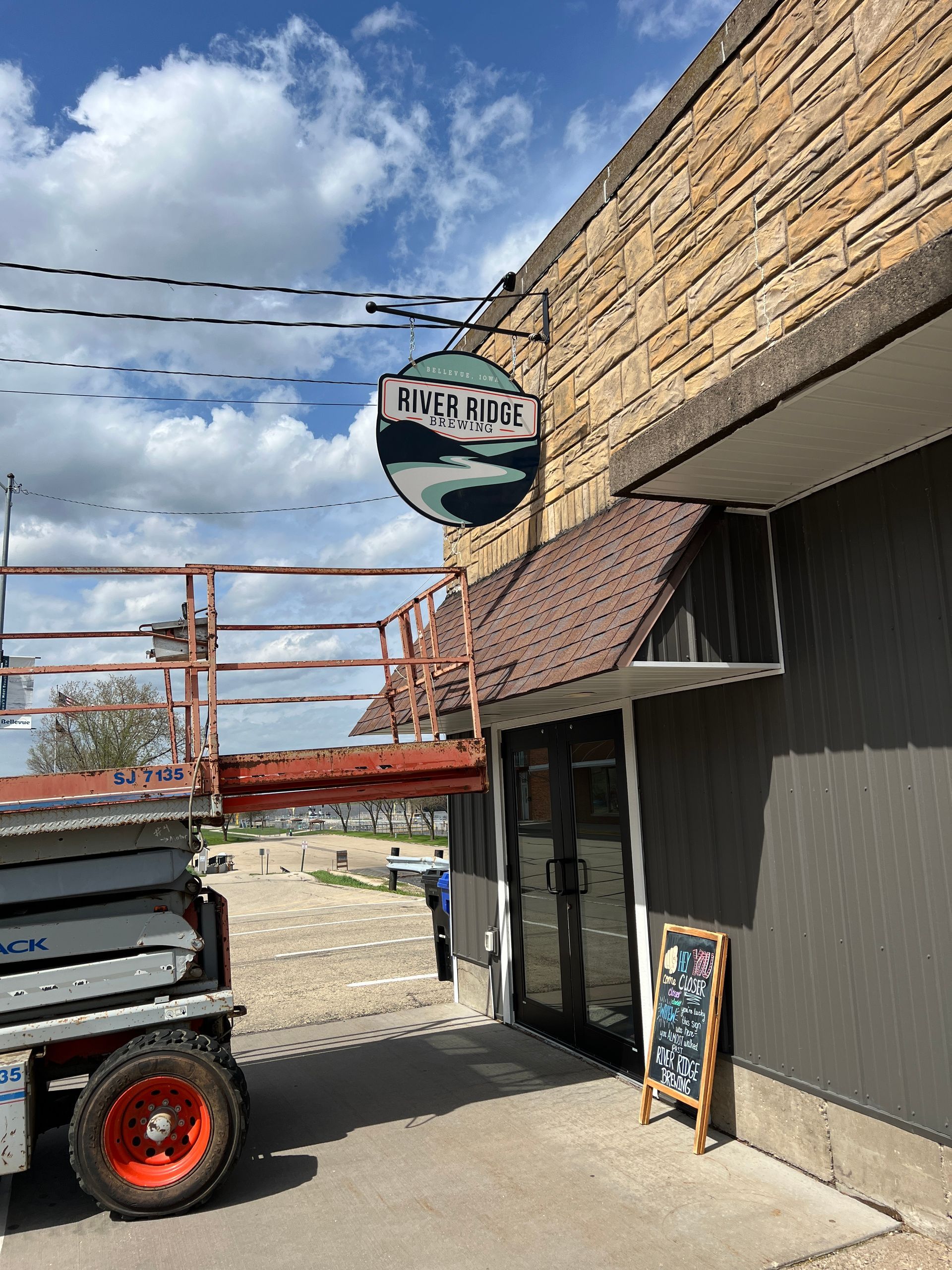
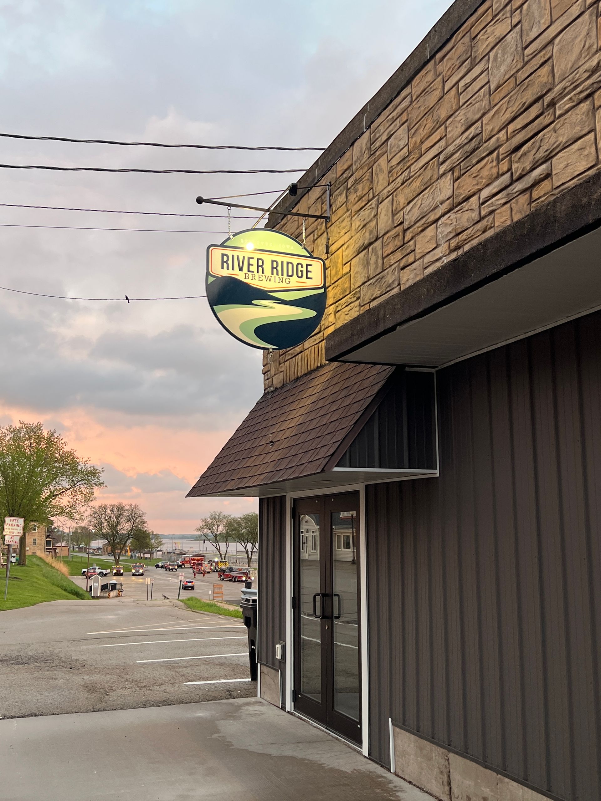
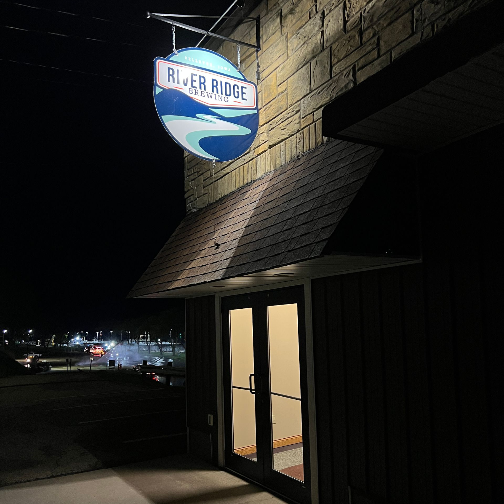
One aspect of bringing the new 2026 look to life was a signage overhaul across all four sides of the brewery building. The highlight of the installation is a custom-made, beautifully lit sign hanging on the street side to welcome guests to "Bellevue's Backyard."
We had the privilege of managing the production timeline alongside a phenomenal lineup of local businesses who knocked it out of the park! We worked with
A&P Graphics & Signs, Cummings Construction and JCI Electric to make sure nobody will have trouble finding their favorite craft brew!
What’s Next?
With three core brew cans down and five more on the way we are working toward the big anniversary in September. The energy in the taproom is palpable! The first 2000 core brew cans were just delivered, together with our “Special Release” can design for seasonal brews. The regulars are loving the return to the brewery's original identity, and the Beer-To-Go fridge is stocked.
This project perfectly highlights what we love most at Sinar Media:
it’s not just about fonts, logos, and colors. It’s about revealing the human stories, the heritage, and the heartbeat that make an organization so valuable to the community around it.